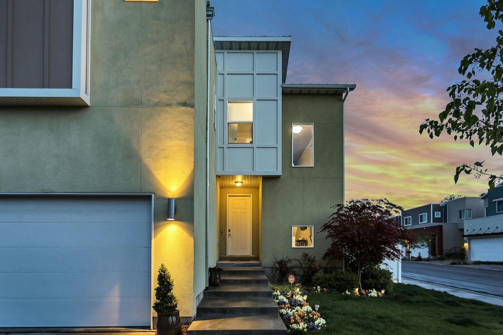
When people talk about smart homes, the conversation often starts with apps, sensors, and lighting scenes. But the materials inside the walls matter just as much. A home built with lower-carbon products can reduce emissions before the first switch is turned on, while also supporting better insulation, comfort, and long-term performance.
That is the practical shift happening now: homeowners and builders are treating building materials as part of the energy story, not a separate design decision. The question is no longer just how a house looks or how fast it can be built. It is also how much carbon is locked into the structure, how well it performs over time, and how easily smart systems can help it run efficiently.
What low-carbon building materials mean
Low-carbon building materials are products that generally require less greenhouse-gas emissions to extract, manufacture, transport, or use than conventional alternatives. Sustainability goes a step further. It also asks whether a material is durable, repairable, responsibly sourced, and suitable for the building’s whole life cycle.
UNEP’s Global Status Report for Buildings and Construction 2025-2026 says buildings and construction account for about 37% of global CO₂ emissions and nearly 50% of material extraction. That is a large footprint, which is why material choice now sits at the center of climate-conscious design.
Why embodied carbon is getting more attention
Embodied carbon is the emissions created before a home is even occupied: mining, logging, processing, manufacturing, and transport. In many projects, those emissions are easier to overlook than the energy used after move-in, but they are increasingly hard to ignore.
UNEP’s earlier report, Building Materials and the Climate: Constructing a New Future, outlines a useful three-part direction for the sector: avoid unnecessary extraction, shift to regenerative materials, and decarbonize conventional materials. That framework is simple enough to remember, and practical enough to use on a real project.
Material options worth considering
There is no single “best” material for every home. The better question is which option fits the structure, climate, budget, and performance needs of the project.
| Material | Why it is used | What to watch |
|---|---|---|
| Timber | Can have a lower embodied-carbon profile and works well in many structural systems. | Needs responsible sourcing, moisture control, and appropriate detailing. |
| Recycled-content products | Reduce demand for virgin raw materials in items such as steel, insulation, and some finish materials. | Check actual recycled content and performance claims, not just marketing language. |
| Low-carbon concrete | Can lower emissions in foundations, slabs, and structural work compared with standard mixes. | Strength, curing time, and local availability matter. |
| High-performance insulation | Helps cut energy use and supports stable indoor temperatures. | Balance thermal performance with fire rating, moisture behavior, and installation quality. |
| Durable finishes | Longer-lasting surfaces reduce replacement cycles and waste. | Choose finishes that can be repaired and maintained without frequent rework. |
For a practical overview of efficient lighting and building systems, the U.S. Department of Energy’s Integrated Lighting Campaign explains how connected lighting and controls can improve energy efficiency and comfort. The same thinking applies to a whole house: good design reduces waste, and good controls make that design easier to live with.
How smart home systems amplify sustainability
Smart systems do not replace good materials, but they help them perform better. Lighting controls reduce unnecessary use. Climate automation keeps temperatures steadier. Energy monitoring shows where the home is doing well and where it is quietly wasting power.
The DOE’s guidance on solid-state lighting solutions is a useful reminder that efficient lighting is not just about the bulb. It is about the full system: fixtures, controls, sensors, and how people actually use the space. In a well-designed home, smart lighting and efficient materials support each other.
A simple example: a well-insulated room with daylight-aware lighting and occupancy controls will usually be easier to keep comfortable and cheaper to operate than a room that depends on heavy heating, cooling, and manual switching. The material choices reduce load; the controls reduce waste.
What homeowners and builders should prioritize
If you are choosing materials for a new build or renovation, start with performance and durability. A low-carbon product that fails early is not a win. You want a balance of lower emissions, reliable function, and straightforward maintenance.
- Check durability: choose products that can stand up to real use, not just a sample board.
- Ask for lifecycle information: look for environmental product declarations or similar documentation when available.
- Think locally when practical: shorter supply chains can reduce transport impacts and support availability.
- Match material to climate: moisture, heat, and temperature swings all affect performance.
- Pair the envelope with controls: insulation and airtightness work better when lighting and climate systems are also efficient.
If you are exploring related home technology choices, the site’s Innovative Smart Home Designs and Smart Lighting Solutions pages offer helpful context. For a broader sustainability perspective, see Energy Efficiency and Sustainability.
A simple checklist for your next project
- Does the material reduce embodied carbon compared with the obvious alternative?
- Is it durable enough for the space and climate?
- Is the sourcing transparent and credible?
- Will it work well with insulation, airtightness, and smart controls?
- Can it be repaired, reused, or recycled at the end of its life?
- Is it available locally or through a dependable supply chain?
That checklist is intentionally modest. Good decisions are usually made by narrowing uncertainty, not by chasing the loudest product claim. If a material looks promising but the documentation is thin, take your time.
The future-proof approach combines materials and systems
Low-carbon building materials matter because they reduce emissions at the source. Smart home systems matter because they help a house use less energy every day. Together, they create homes that are more efficient, more comfortable, and easier to maintain over time.
If you are planning a renovation or new build, start with the shell, then look at the controls, then bring the two into conversation. That is often where the real gains appear. For broader site information or to continue the conversation, visit the home page or use the contact page.